Increase progression to completion
Move more visitors from interest through prequalification to a completed application.
Fortiva Mastercard Application Funnel
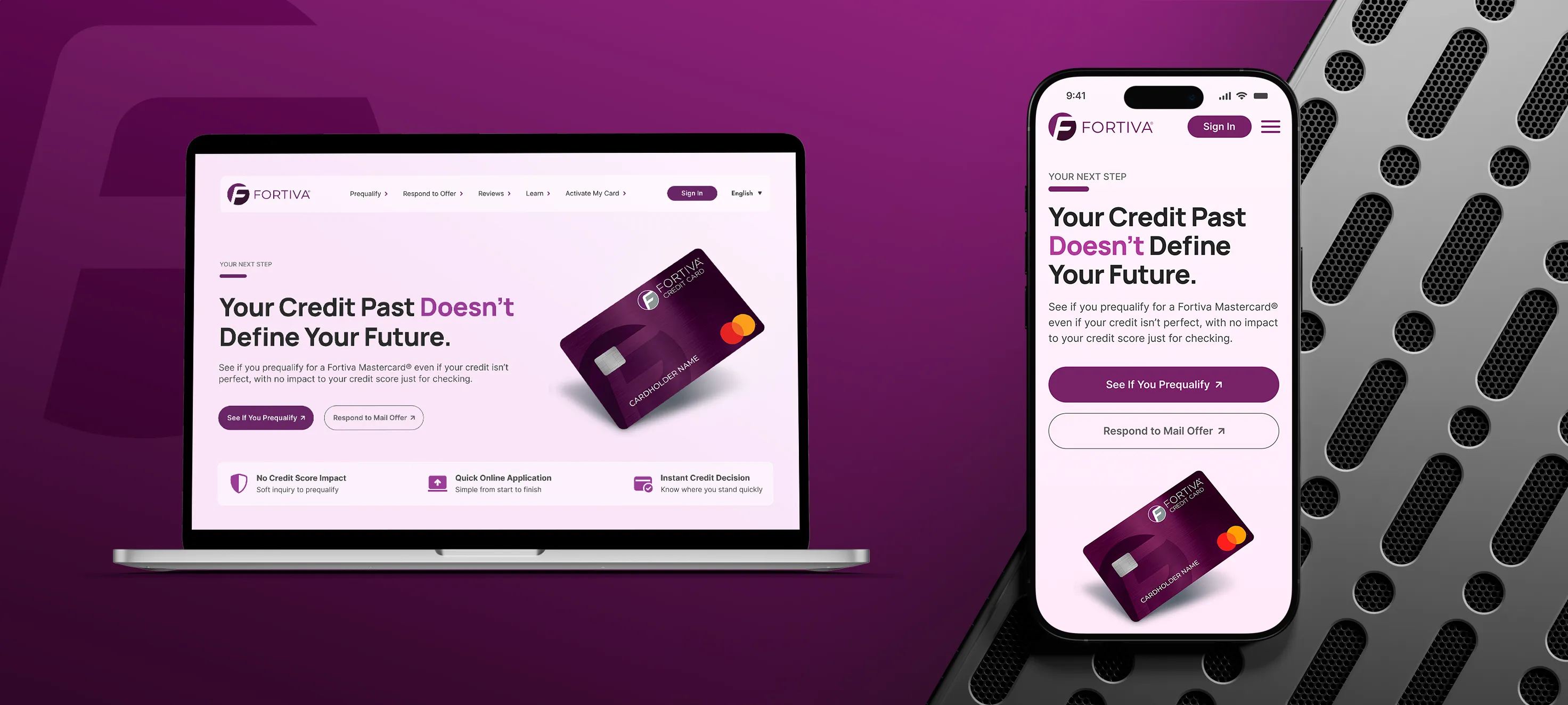
I redesigned the Fortiva Mastercard landing experience around a clearer decision path, making the offer more relevant, reducing uncertainty around prequalification, and helping customers understand the product before taking action.
The Challenge
Fortiva serves consumers who may have had difficulty qualifying for traditional credit, so the deciding factor is rarely more information. It is less uncertainty. The existing page held what customers needed, but generic messaging, competing actions, and reassurance buried in fine print made them work harder than necessary to judge whether the offer was relevant and what to do next.
Move more visitors from interest through prequalification to a completed application.
Quickly determine whether the card is relevant, credible, and worth pursuing.
Reduce the uncertainty between interest and prequalification with a clearer progression from relevance, to reassurance, to action.
Experience Audit
I reviewed the existing page across value clarity, CTA hierarchy, reassurance, product visibility, content density, and progression toward prequalification. The page was well built and on brand. What it lacked was a point of view about what a visitor should understand first.
Six findings shaped the redesign. Select the blue plus hotspot on any screen to read the detail behind it.
Finding 01
Original experience
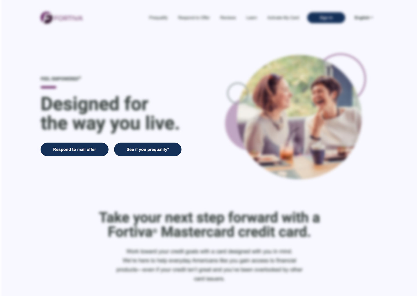
“Designed for the way you live” was warm but broad enough to describe almost any consumer credit card. It never established why Fortiva was particularly relevant to someone whose credit history had limited their options.
Finding 02
Original experience
Respond to mail offer and See if you prequalify carried the same visual weight, with the mail-offer action placed first. Visitors who arrived without a mailed offer had to work out which path was theirs.
Finding 03
Original experience
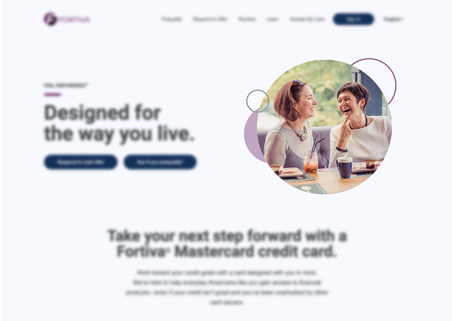
Stock photography carried the hero and the product barely appeared. The imagery set an emotional tone but left customers to infer what was actually being offered. A financial product needs to establish that clarity immediately.
Finding 04
Original experience
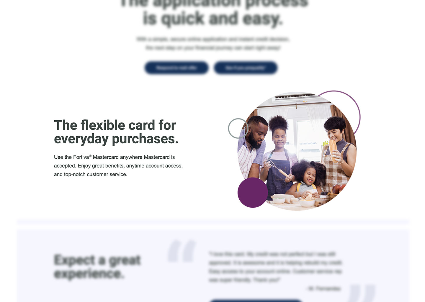
“Enjoy great benefits, anytime account access, and top-notch customer service” was the closest the page came to describing ownership. With rewards, fees, and account features unstated, there was little to evaluate and nothing to compare.
Finding 05
Original experience
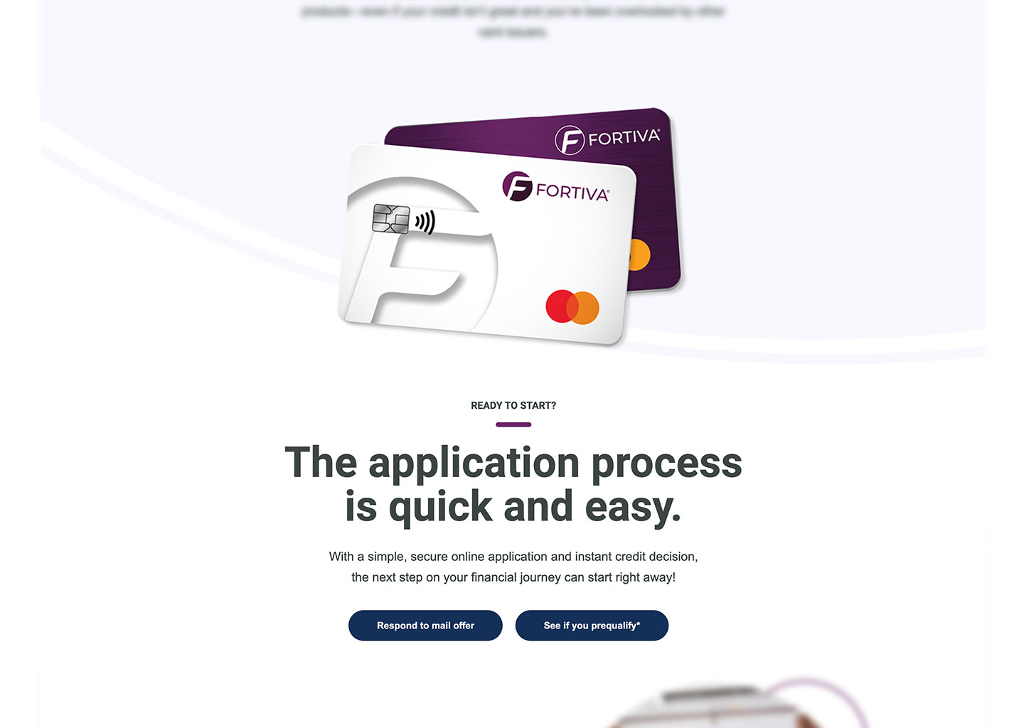
Product, application, lifestyle, benefits, and a testimonial were all present, but they did not build toward one decision. The card appeared mid-page detached from any action, then a second centered hero repeated the same button pair.
Finding 06
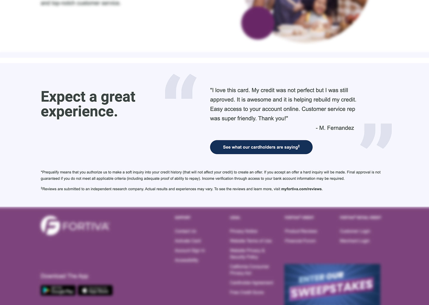
Original experience
The page did explain that prequalifying is a soft inquiry that does not affect your credit, but only in the asterisk footnote at the very bottom. Information capable of lowering perceived risk should not require searching for it.
Audience & Hypotheses
No formal research was available, so the process stayed light: audit the existing experience, locate the points of decision friction, turn them into hypotheses, restructure the page around the customer’s decision, design across breakpoints, then measure after launch.
The needs below are inferred from the product, the audience, and the conversion goal. They are design assumptions rather than findings. Each one carries the hypothesis it produced.
The audience is defined by a credit history that has limited their options elsewhere, so relevance has to be settled on the first screen. Hypothesis: if the hero speaks to moving beyond past credit challenges, customers may identify with the offer faster.
On the old page the answer sat in the asterisk footnote. Hypothesis: if credit-impact reassurance is treated as a selling point rather than a disclaimer, the perceived cost of checking eligibility drops and more visitors are willing to start.
Vague benefit claims gave customers nothing to weigh. Hypothesis: if rewards and cardholder benefits are broken into recognizable modules, customers can evaluate the offer with less effort.
Credibility is a prerequisite for handing over personal information, not a closing argument. Hypothesis: if reassurance and social proof appear before the ask, more visitors continue past the first screen.
A card is easier to commit to when its day-to-day use is visible. Hypothesis: if account functionality is shown rather than described, the product feels more tangible and easier to judge.
Two equally weighted actions ask the customer to make a choice before they are ready. Hypothesis: if prequalification is the clearly dominant action throughout, customers spend less effort working out the next step.
Page Hierarchy
The old page held most of this information already. I sequenced it so each stage answers one question and hands the customer to the next: uncertainty, then relevance, reassurance, value, confidence, and action.
Emotional relevance “Your credit past doesn’t define your future.” Progress framing, in place of a lifestyle message.
Risk and friction reduction No credit score impact, a quick application, and an instant decision address the three hesitations directly below the hero.
Product value Cardholder benefits establish what ownership actually provides.
Progress The path to a limit increase connects the card to forward movement rather than a static balance.
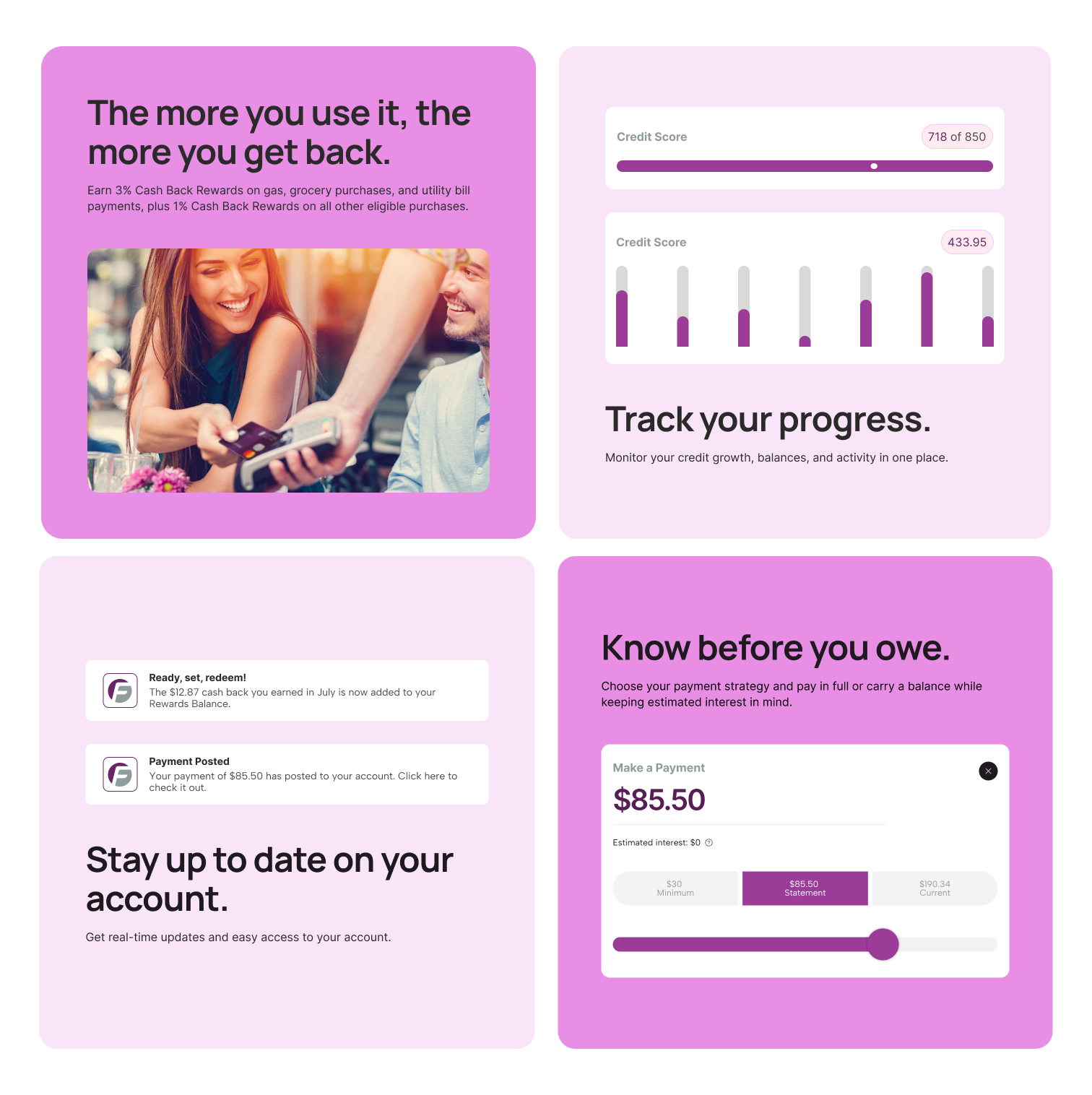
Product functionality Rewards, credit tracking, notifications, and payments make day-to-day use tangible.
Everyday utility The card in ordinary use, reinforcing practicality rather than reintroducing the product.
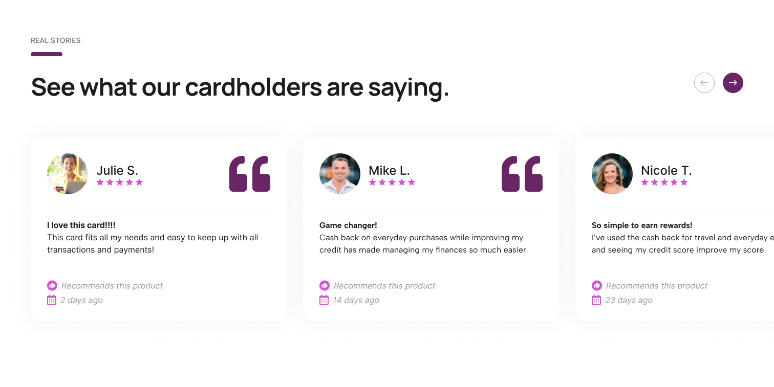
Social proof Multiple cardholder reviews replace a single isolated testimonial.
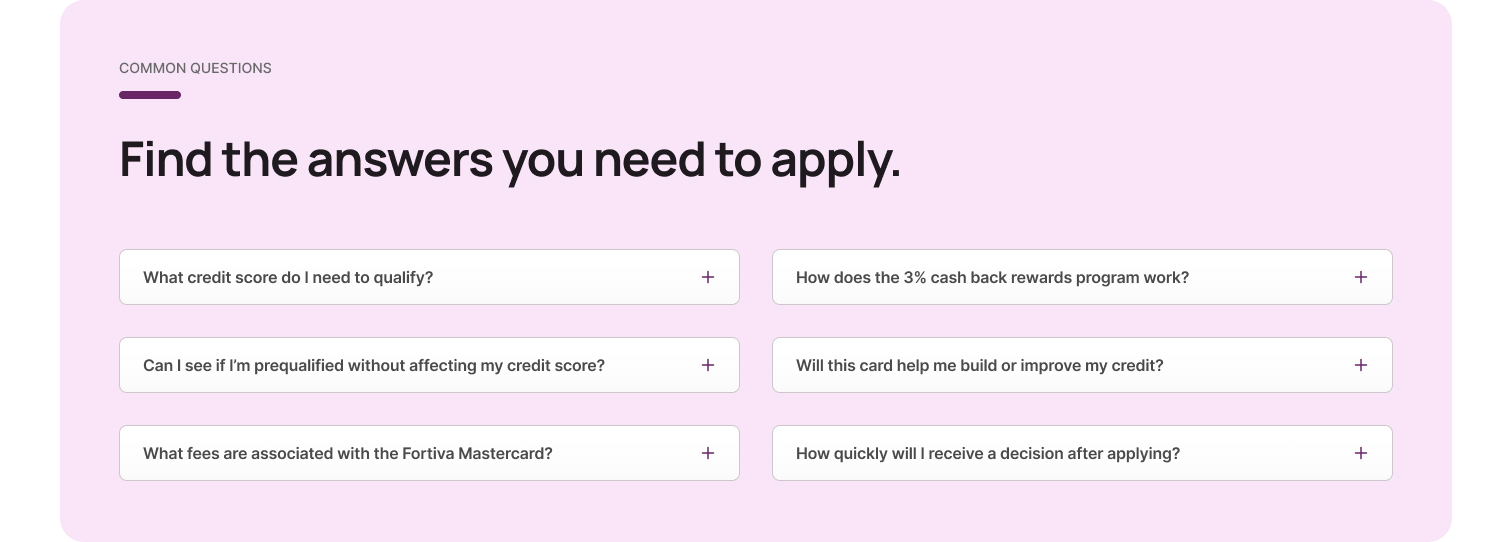
Objection handling FAQs resolve the specific questions that remain once the product is understood.
Conversion A final prequalification CTA that needs to do nothing but offer the step.
The customer’s decision path
The Solution
The hero now carries a coordinated message rather than four unrelated pieces of copy: forward momentum, emotional relevance, product relevance, risk reduction, action. Everything below it answers one customer question at a time.
The screens below follow the live page in scroll order, hero to close. Select the blue plus hotspot on any screen to read the reasoning.
Response 01
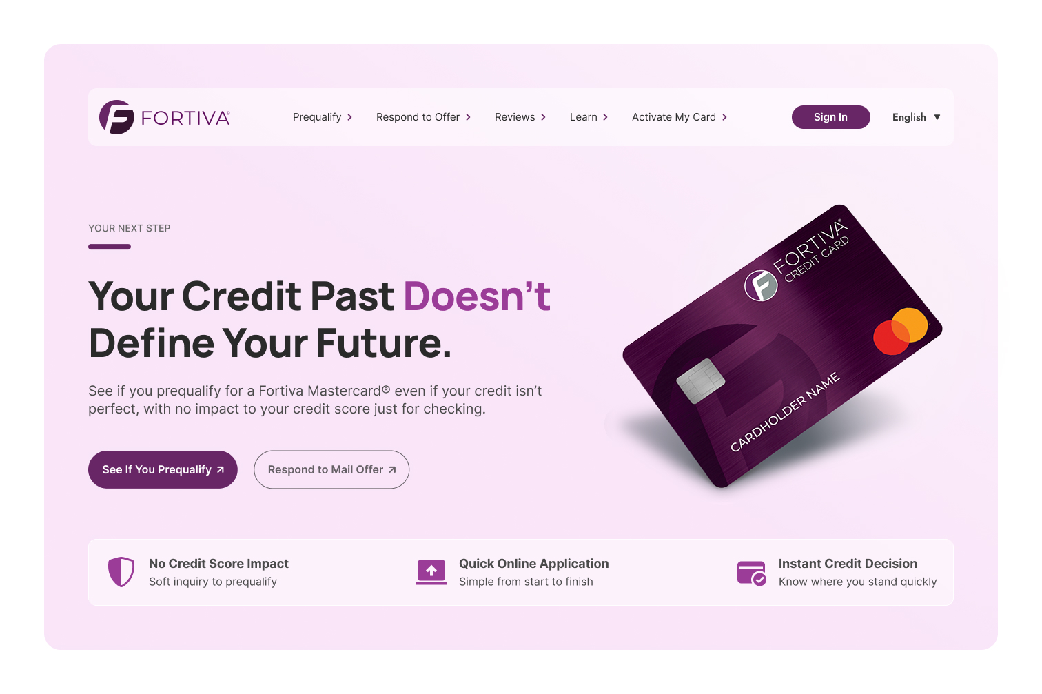
Problem → design response
Answers findings 01, 02, 03, and 06. “Your credit past doesn’t define your future” frames progress without naming failure, and the card replaces stock photography as the visual anchor. See if you prequalify is now the filled primary action with respond to mail offer as a secondary route, so visitors no longer have to work out which button is theirs. The reassurance strip sits directly beneath it, so risk, effort, and timing are answered the moment the primary action appears, not further down the page.
Response 02
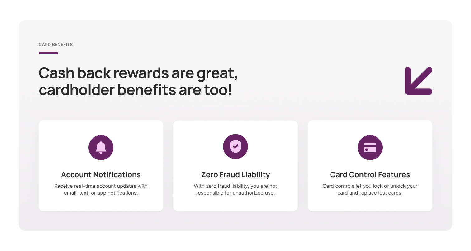
Problem → design response
Answers finding 04. The hero strip answers “why is it safe to check?” This section answers a different question: “what do I get if I become a cardholder?” Keeping them apart lets each land, and named benefits in titled cards replace the old page’s general claims.
Response 03
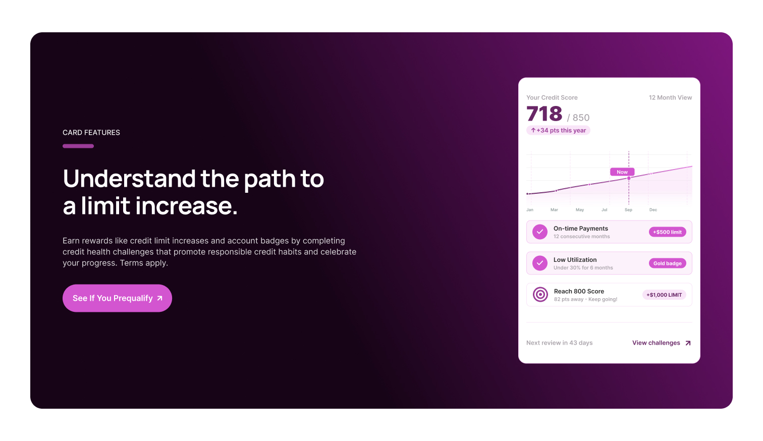
Problem → design response
The original page stopped at approval. Tying credit health challenges to a visible path toward a limit increase gives an approved cardholder a reason to return, extending the relationship past the first decision instead of ending the story there.
Response 04
Problem → design response
Building on the same idea as the benefits section above, rewards, credit tracking, notifications, and payment visibility are shown as interface rather than described as features, moving the page from product marketing toward how the account actually behaves after approval.
Response 05
Problem → design response
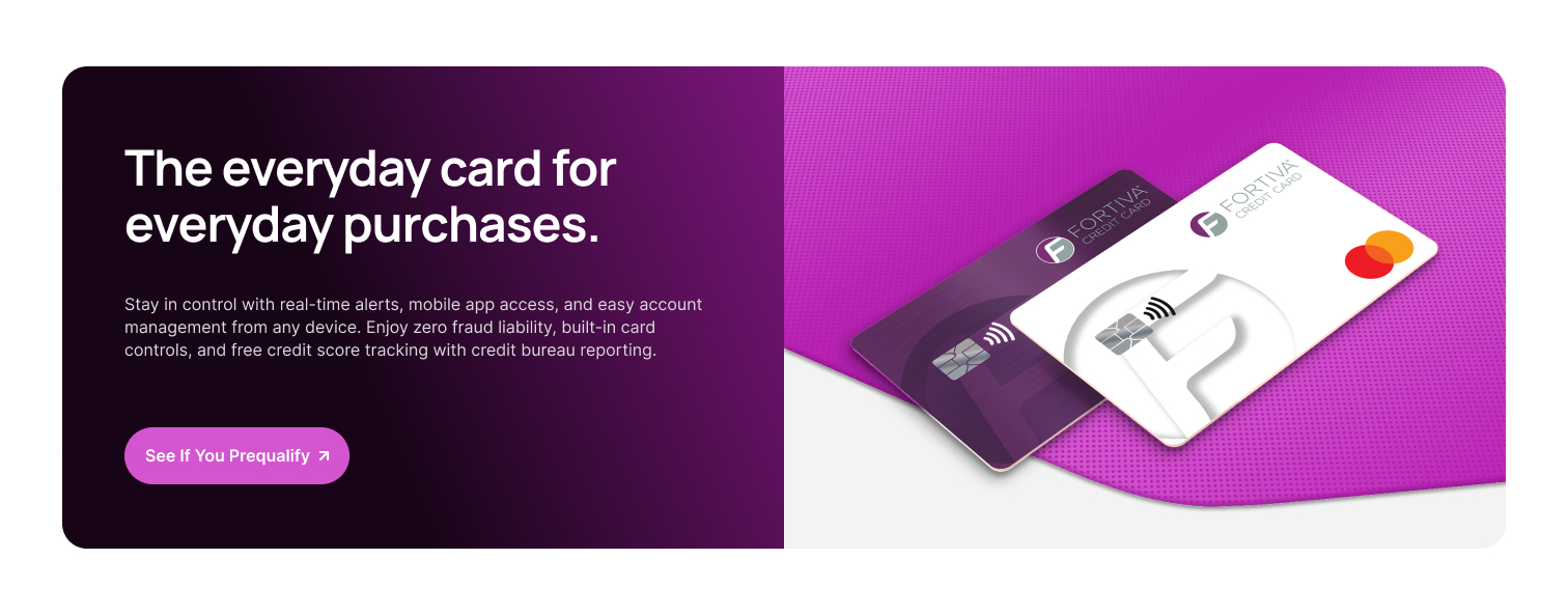
Not every visitor acts in the hero. Restating the everyday-use promise and the prequalification action partway down the page catches visitors who scrolled past the first ask, without introducing a new message to track.
Response 06
Problem → design response
By this point the product and its functionality are understood, so the remaining doubt is personal: will this work for someone in my situation? Real cardholder reviews answer that in a voice the brand can’t use for itself, right before the objections are addressed directly in the FAQ.
Response 07
Problem → design response
What remains at this point is specific: eligibility, credit impact, fees, and timing. Resolving those immediately before the closing CTA lets the final section do one job: offer the next step.
Response 08
Problem → design response
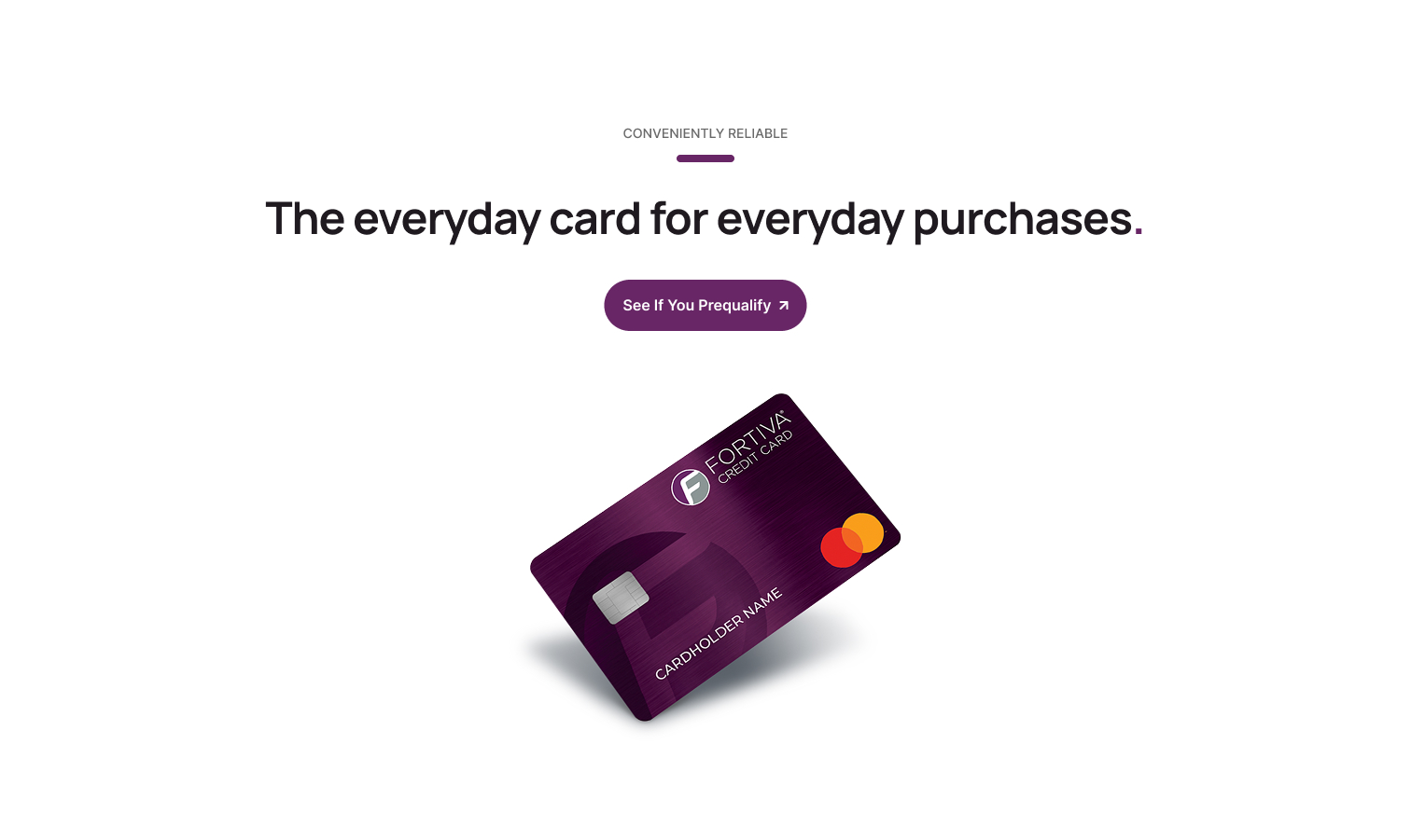
Answers finding 05. The old page lost its own thread here, repeating a second centered hero with the same button pair mid-scroll. The redesign gives every section one job and ends with exactly one close: the same headline promise, the same card, the same single action, with nothing new introduced this late.
Final Design
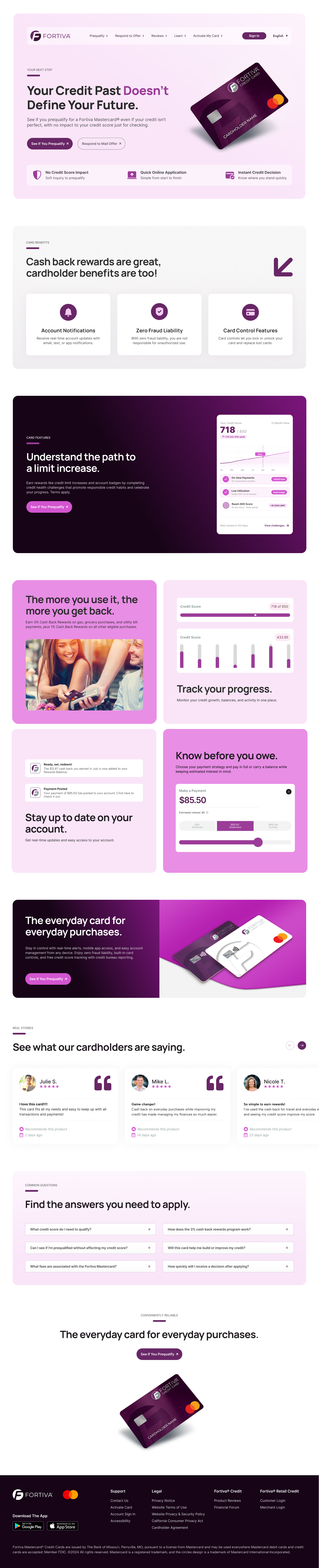
Relevance, reassurance, value, progress, proof, and objection handling in sequence, with one primary action carried throughout. Alternating light, dark, and product-led sections mark each change in purpose, so a long page stays scannable. Scroll inside the display to explore it.
Mobile Walkthrough
The mobile experience preserves the same priorities as desktop: value first, reassurance second, and action always visible. It also reduces visual competition and makes content easier to scan vertically.
The reassurance strip stays directly beneath the hero, the benefit and feature modules stack in comparison order, and the prequalification action returns at each point where a visitor is likely to have resolved a question.



Results
Following the redesign, the landing page improved across the primary behaviors the experience was designed to influence: more customers progressed through the funnel, fewer exited early, and more engaged with the apply path.
These were launch comparisons rather than a controlled test, so no single change can be credited with the movement. The gains aligned with the redesign’s focus on clearer messaging, stronger CTA hierarchy, earlier trust, and a more intentional decision path.
+38%
Conversion Rate
−22%
Bounce Rate
+18%
Apply-CTR
Conclusion
The Fortiva redesign shifted the experience from broad lifestyle messaging toward a more deliberate customer journey. Establishing relevance earlier, reducing the perceived risk of prequalification, separating reassurance from cardholder value, making product functionality tangible, and resolving objections before the final CTA produced a clearer path from consideration to action.
It is a useful reminder that conversion work is rarely about adding information. It is about ordering it. Messaging strategy, behavioral framing, UX hierarchy, and visual design have to move together to do it.
Next Projects