Increase enrollment through a clearer story
Translate a feature-rich rewards program into a simple, compelling story with enrollment as the clearest next action.
Dell Technologies
I designed a conversion-focused landing page experience that simplified Dell Rewards messaging, improved scanability, and guided users toward enrollment through stronger hierarchy and structure.

Overview
Dell Rewards offered real value, but I found promotional offers, financing details, points, and membership benefits competing for attention with no clear hierarchy. My goal was to simplify that volume of information into a focused story that made enrollment the clear next step.
Translate a feature-rich rewards program into a simple, compelling story with enrollment as the clearest next action.
Quickly make sense of promotional offers, financing details, points, and membership benefits, and know what to do next.
Guide users from understanding the program to enrollment through consistent hierarchy, pacing, and calls to action across desktop and mobile.
Problem
Shoppers had to make sense of promotional offers, financing details, points, and membership benefits within one experience. Without a clear hierarchy, the program felt more complicated than valuable, and the path to enrollment was easy to miss.
My design challenge was to turn that volume of information into a focused story that answered the most important questions in sequence and kept enrollment visible across desktop and mobile.
Goals
I wanted the experience to communicate immediate value without losing the details users need to feel confident, with every goal supporting a simpler decision path from first impression to enrollment.
Explain the program and its primary benefit above the fold.
Make earning points, redeeming rewards, and member benefits easy to scan.
Use consistent enrollment actions from the hero through the final offer.
Preserve hierarchy, readability, and action priority across screen sizes.
Design Process
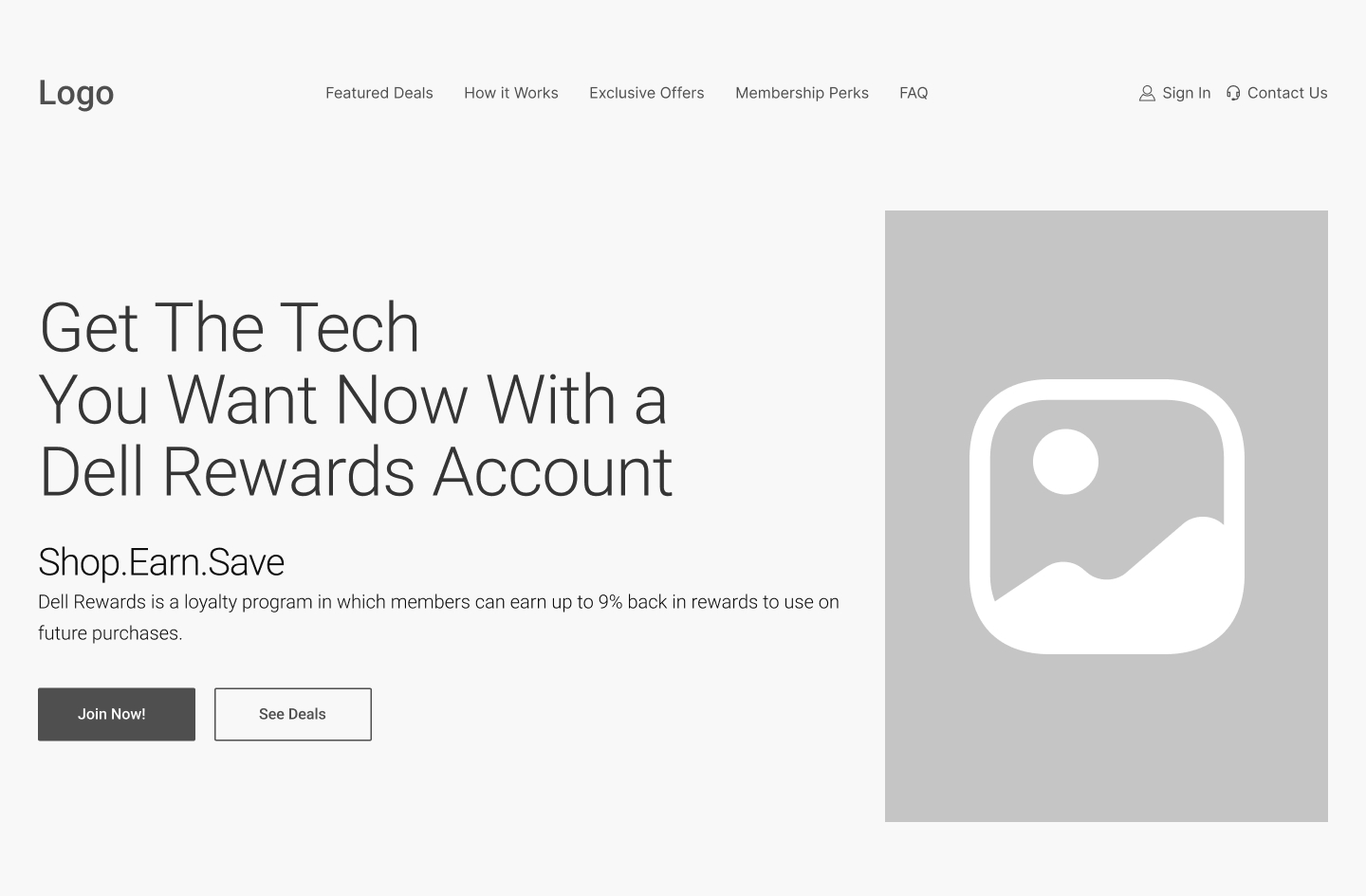
I mapped the messages users needed at each stage, organized them into a deliberate page sequence, and tested that hierarchy in low-fidelity wireframes before applying Dell’s visual system.
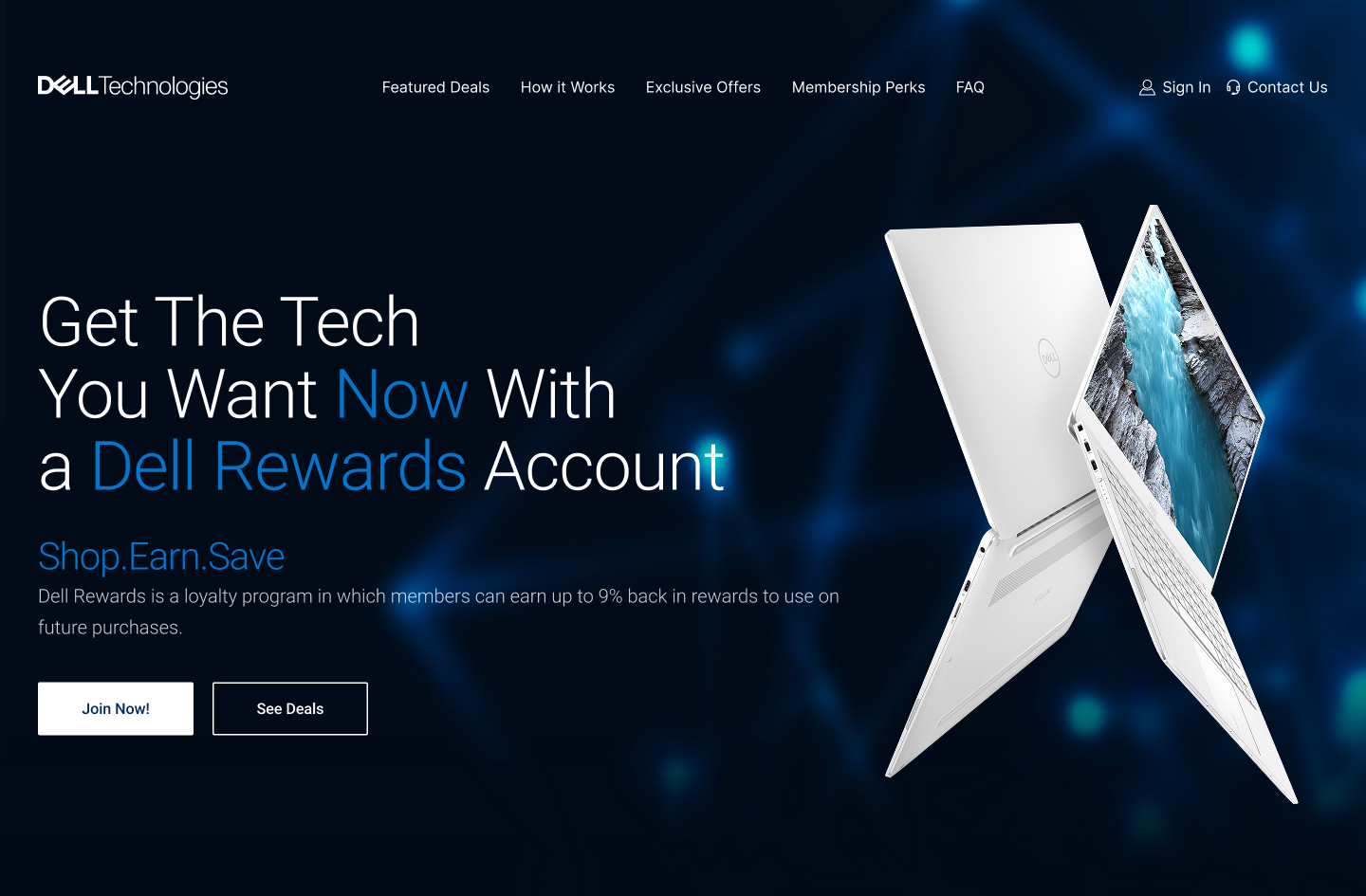
The comparison below shows how each module progressed from structure to final design while preserving the same focused enrollment path.
Group program details, offers, and requirements around the questions shoppers needed answered.
Sequence value, education, benefits, proof, and objection handling into a clear narrative.
Explore hierarchy, pacing, and CTA placement without the distraction of final visual styling.
Apply the brand system, product imagery, and responsive behavior while checking clarity across the full page.
Page Flow
I structured the experience to guide users from understanding the rewards program to enrollment without overwhelming them with information too early. Each section answers one user question in sequence: what the program offers, how rewards work, why membership is valuable, and how to enroll.
How Dell Rewards Works Step-by-step clarity on joining, earning, and redeeming.
Earning Points A visual explanation of how purchases build value.
Exclusive Offers Benefits framed as member-only advantages.
FAQ Objection handling to reduce enrollment hesitation.
The customer’s decision path
Final Solution
I used modular content, product-forward imagery, and deliberate pacing to make a complex program feel approachable. Each section answers one question and moves the shopper toward the next decision.
Select the blue plus hotspot on any screen to see the decision behind it.
Solution 01
Design detail
A focused headline, product imagery, and paired actions make the primary value and enrollment path immediately visible.
Solution 02
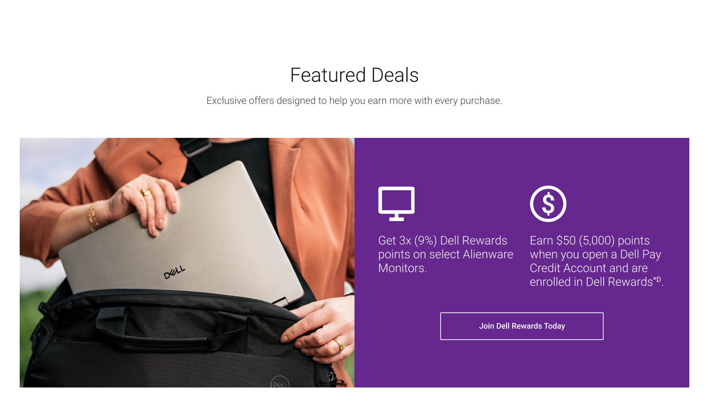
Design detail
The split module combines lifestyle imagery, concise benefit statements, and one clear enrollment action.
Solution 03
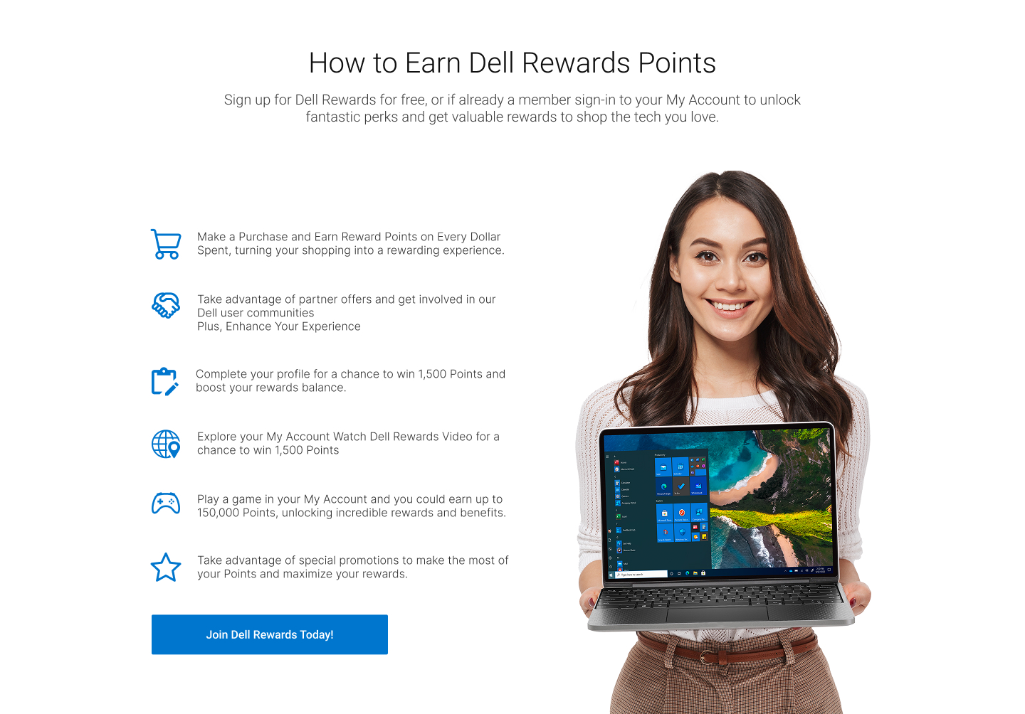
Design detail
Short steps and supporting product imagery reduce the effort required to understand how the program works.
Solution 04
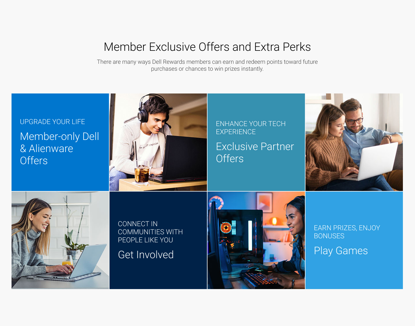
Design detail
A modular tile system separates each perk while a repeated rhythm keeps the collection cohesive.
Solution 05
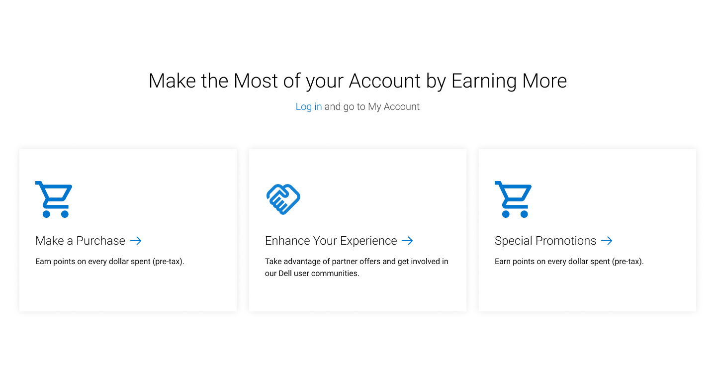
Design detail
Scannable cards show how purchases, partner offers, and promotions continue creating value for members.
Solution 06
Design detail
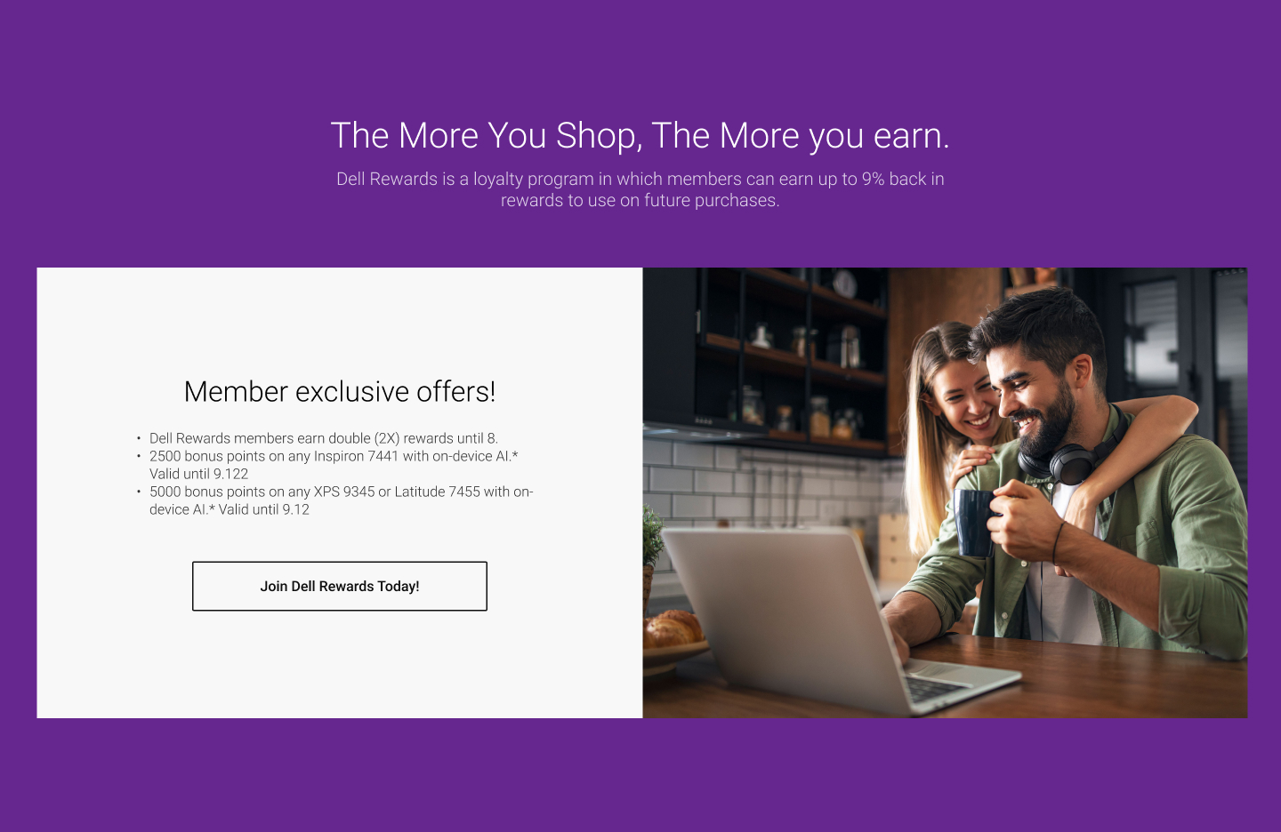
Bonus-point offers on featured products are framed as a member-only advantage, reinforcing that the value of Dell Rewards continues well past enrollment.
Solution 07
Design detail
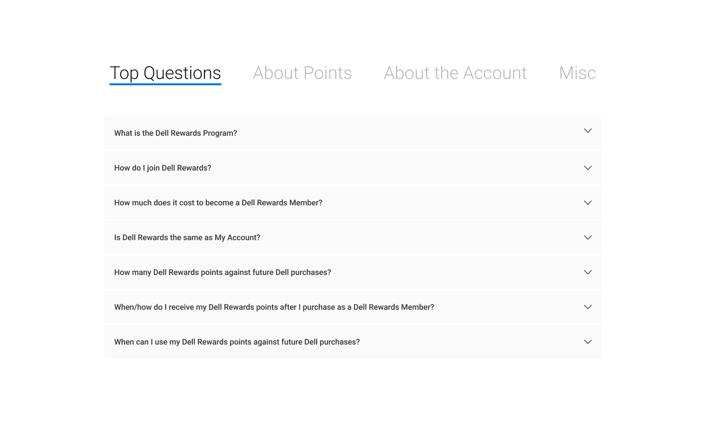
Grouped FAQs address program details and common hesitation at the point where shoppers are deciding whether to enroll.
Final Design
I combined structured hierarchy, modular content, and product-focused visuals to make the program easier to understand and enrollment easier to find.

Mobile Walkthrough
For mobile, I focused on improving readability while maintaining the hierarchy and enrollment path established on desktop.



Results
After launch, the page showed strong engagement across key acquisition metrics. Its structure helped users understand the rewards value, stay engaged through the content, and move toward enrollment through consistent calls to action across desktop and mobile.
24%
Enrollment Start Rate
19%
Lower-Than-Benchmark Bounce Rate
17%
CTA Engagement Rate
Conclusion
This project reinforced how important hierarchy and pacing are when designing acquisition-focused landing pages with large amounts of promotional and rewards content. The challenge was not adding more information, but organizing the experience so users could understand the value quickly without feeling overwhelmed.
It also reinforced the importance of designing modular systems that maintain clarity across desktop and mobile. Many of the strongest decisions came from simplifying layout structure, creating more intentional section flow, and guiding attention toward a single clear enrollment path.
Next Projects