Strategic, not cold
Data-driven should read as dependable and purposeful, not like a dashboard.
Britebox
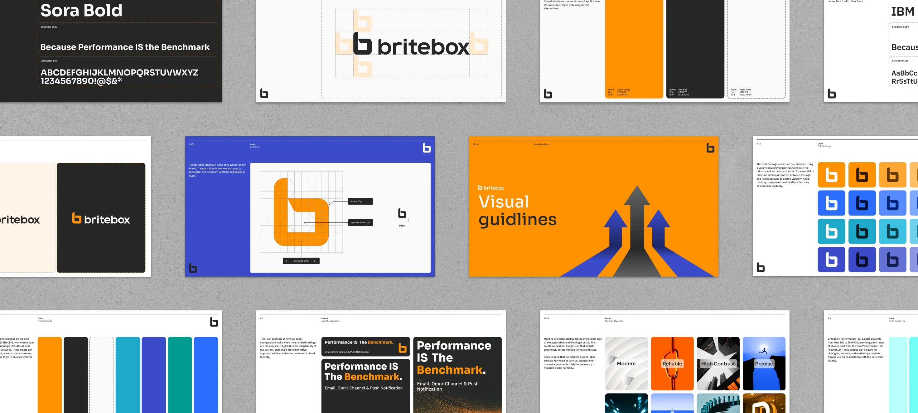
Britebox turns strategy, creative execution, media, and testing into measurable growth for its clients. I developed the brand's visual identity and the guideline system that keeps it consistent — flexible enough for campaigns and reporting, precise enough to stay recognizable at any scale.
Overview
Britebox is a performance-marketing company: strategy, creative execution, media buying, testing, and optimization, run as one continuous loop toward measurable growth. That's a crowded, often visually generic category — a lot of marketing agencies signal "data-driven" with the same cold dashboards and stock-photo confidence.
The identity needed to do two things the category rarely manages together: feel genuinely strategic — precise, considered, built on a real system — while still reading as energetic and direct rather than corporate. I built that system from the logo outward: a mark, a color palette, a type pairing, and a grid, documented as a guideline set that Britebox can apply consistently without flattening into boilerplate.
The Challenge
Performance-marketing brands live across an unusually wide range of surfaces — campaign creative, landing pages, client reports, internal decks, social content — often produced under deadline by different hands. The system had to survive all of that without a designer redrawing it each time.
Data-driven should read as dependable and purposeful, not like a dashboard.
Signal Orange had to carry momentum and confidence without tipping into noise.
Avoid the interchangeable SaaS-blue look most of the category defaults to.
Campaigns, landing pages, reports, decks, and social all draw from the same frictionless rules.
Strategic Direction
"Britebox" carries two ideas the identity needed to hold onto simultaneously: brightness — sharp, energetic, idea-driven — and a box: contained, structured, built to be opened and used. That tension became the brief for the mark itself: a symbol that reads as a container for ideas, with enough openness to signal communication rather than a sealed package.
Positioning work landed on eight pillars, each expanded into the supporting language below — the brief every design decision that follows had to answer to. The guideline system carries the same discipline through to execution: colors stay flat — no gradients — "to maintain a clean and consistent visual language," since gradients "dilute the brand's clarity and introduce visual inconsistency across different media and screen sizes." Layout scales from one modular rule rather than bespoke grids per format. Strategy shows up as restraint, not just as a mood board.
Brand Position Keywords
Accuracy, alignment, intention, refinement, control, grids, exact proportions, sharpness.
Contemporary, forward-thinking, sleek, tech-driven, digital-first, agile, up-to-date.
Vivid, striking, signal, impactful, dynamic, sharp, visible.
Consistency, predictability, endurance, trust, dependable, systematic, stability.
Velocity, vibrant, active, electric, drive, momentum, action-oriented, punchy.
Efficiency, simplicity, uncluttered, optimized, frictionless, cohesive, integrated.
Purposeful, strategic, focused, deliberate, considered, planned, conversion-focused.
Confident, authoritative, distinctive, punchy, direct, memorable, strong.

Identity System — Logo
The logomark is a lowercase "b" — a lowercase system feels more direct and less corporate than a capital-letter mark, in keeping with the "direct" personality the brand called for. Look closely and it folds like a dog-eared corner at the top of the bowl, opening a small negative-space window inside it. Read together, that folded corner and the window it opens land somewhere between a speech bubble and a notification — an apt shape for a brand built on communication and performance signals, though that reading is my own observation of the finished mark rather than documented construction language in the guidelines.
1.1 — Logomark
The Britebox logomark is the core symbol of the brand. It should always be clear and easy to recognize. The minimum width for digital use is 60px.
 On light backgrounds
 On dark backgrounds
Signal Orange, accent use
On dark backgrounds
Signal Orange, accent use
1.2 — Logotype
The Britebox logotype is the full wordmark. Use it when the brand name needs to be clear and readable on its own. Always present it in its original form, without altering the type, weight, or spacing.
 On light backgrounds
 On dark backgrounds
1.3 — Lockup
The lockup combines the logomark and the logotype. Use this version when the full brand name needs to appear alongside the symbol. Do not alter the spacing or arrangement.
 Carbon Black, on light backgrounds
 Signal Orange + Paper White, on dark backgrounds
Minimum clearspace on every side equals the logomark's own height and width. No text or graphics inside that zone.
Signal Orange, Carbon Black, or Paper White only. Carbon Black on light backgrounds, Paper White on dark backgrounds.
Applied generally in the bottom-right corner at 2× the margin unit, so it scales proportionally with every format.
1.7 — What to avoid
Don't use color combinations that make the logomark hard to read.
Don't use different colors for the logotype and the symbol.
Don't disproportionately stretch or distort the logo.
Don't scale, reposition, or otherwise modify the logo.
No outlines, drop shadows, bevels, or other stylistic effects.
Don't place the logo over imagery that reduces its legibility.
Identity System — Color
Britebox relies on flat, solid color fills to keep the visual language clean and consistent. Gradients are ruled out entirely: they "dilute the brand's clarity and introduce visual inconsistency across different media and screen sizes." Where extra depth is needed, the system layers solid colors at different opacities instead of blending.
Core palette
Accent palette
The main palette expands on four accent colors — Electric Blue, Momentum Cyan, Precision Indigo, and Performance Teal. These are for highlights, accents, and marketing materials, always used in balance with the core palette.
Gray scale
A neutral ramp built from Carbon Black, for text, backgrounds, borders, and subtle UI elements.
Identity System — Type
Sora's geometric, rounded-terminal letterforms echo the logomark's own rounded corners, which is why it carries every headline. IBM Plex Sans takes over once the brand needs to explain rather than announce — sub-headlines in SemiBold, body copy in Regular. Both are used exactly as specified across every brand communication.
Because Performance IS The Benchmark.
Because Performance IS The Benchmark.
Our success isn't rocket science, just old fashioned listening to our clients, strategic planning and ongoing communication with our experienced team.
AaBbCcDdEeFfGgHhIiJjKkLlMmNnOoPpQqRrSsTtUuVvWwXxYyZz 1234567890 !@$&*
Identity System — Grid
Margins are derived by dividing the longest side of the application by 25 — one modular unit that scales proportionally across every format, from a business card to a billboard. In extreme aspect ratios, very wide or very tall applications, that margin may need manual adjustment for optical balance. Headlines key off the same margins: cap-height aligns to the top margin, with ascenders allowed to extend beyond it.
Compact format — margin proportional to frame width, following the ÷25 rule. (Illustrative recreation; not to exact pixel scale.)
Tall format — the same modular margin, same headline rule, different aspect ratio.
Identity System — Iconography
The Figma file's icon content is a research mood board pulling references from several open icon libraries — useful for direction, not a finished Britebox-specific set. Rather than invent one to fill this section, here's the brief for building it properly, derived from the mark's own geometry.
Britebox service icon set (Strategy, Creative, Media, Testing, Optimization, Reporting)
SVG, 24×24 viewBoxbritebox-icon-{name}.svgThe System In Use
The modular grid, flat color, and Sora/IBM Plex Sans pairing shown above are the real mechanics that let Britebox stay recognizable across formats — the two frames below are the guidelines' own construction examples, not campaign work. Finished applications (landing page, social, email) are still to be designed; placeholders below mark exactly what's needed.
Landing page hero application
WebP or AVIFbritebox-landing-hero.webpSocial post template
WebP or AVIFbritebox-social-template.webpEmail / push notification header
WebP or AVIFbritebox-email-header.webpOutcome
Britebox now has a logo, color, and type system specific enough to be recognizable at a glance and flexible enough to survive the category's pace — campaigns, reports, and decks built by different hands on tight timelines. The modular grid means new formats don't require new rules, and the flat-color, no- gradient discipline keeps every application looking like it came from the same brand, not just the same folder.
What's documented here is the system itself — the applications shown above with placeholders are the next phase of putting it to work.
Next Projects