Revive Credit
Introduction
When I was presented with the task of designing the Revive Credit landing page I had a simple idea—a credit card for the folks who’d been kicked to the curb, those left to pick up the pieces of their financial mess. The mission? To help people stand back up, dust themselves off, and say, “I can do this.” The headline hit me like a bolt of inspiration: “Revive Your Finances with the Power of Credit.”
It needed to resonate. It had to scream hope in a world that often feels like a dark alley. So, with the weight of that challenge on my shoulders, I got to work.
01The Challenge
Picture this: a person sitting in front of their screen, heart pounding, fingers trembling over the keyboard. They’ve been turned away too many times to count. “No credit checks or turndowns,” I thought. That had to be clear. They needed to feel like they were being handed a lifeline, not another letdown. I had to make them believe, even for a second, that this card was their ticket back into the light.
I had to weave a story that spoke to their souls while laying out the raw details—low monthly payments, a buy now, pay later feature. Each word had to hit hard, each sentence a step toward redemption.
02Design Approach
1. Understanding the Audience: I dove into the minds of these folks, the ones who needed this card more than anything. They were battered but not broken. I knew I had to craft a message that wasn’t just a sales pitch but a call to arms. “Revive Your Finances with the Power of Credit.” It had to be a mantra, something that made them sit up and take notice.
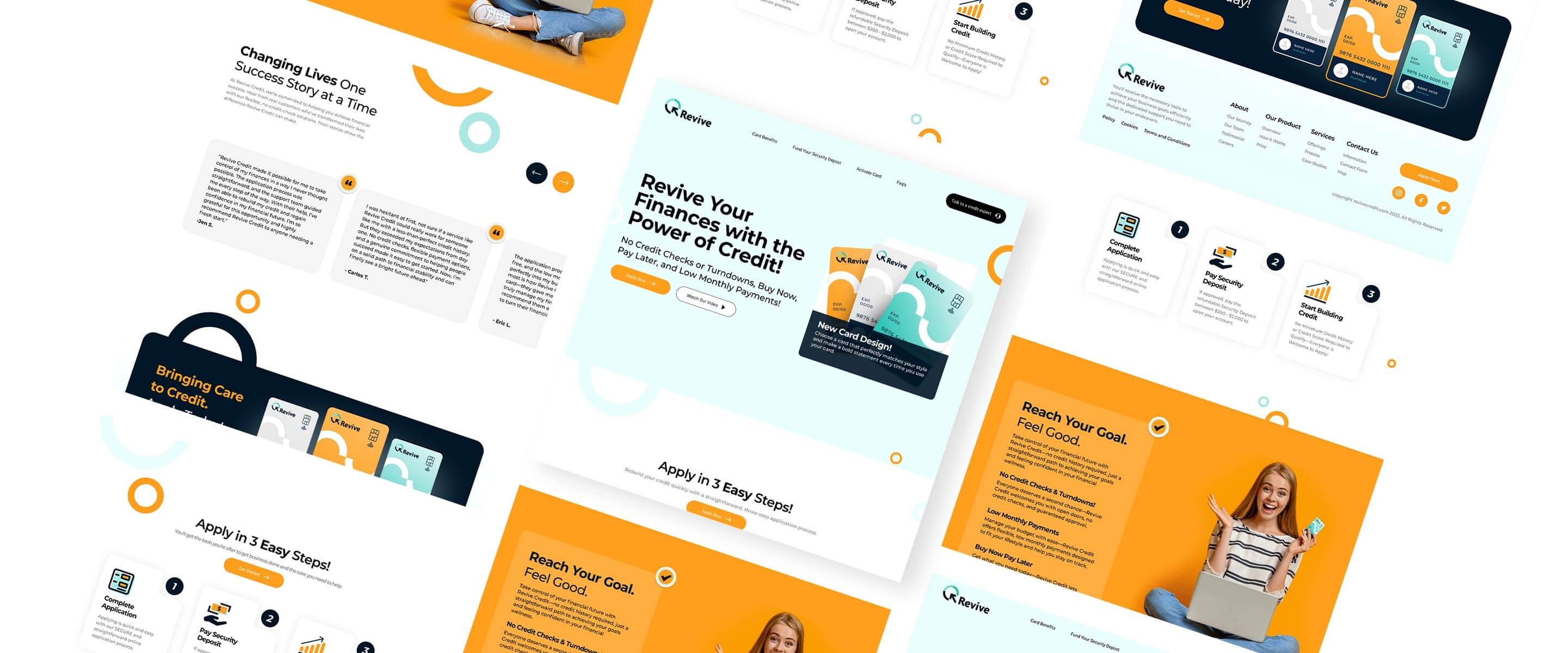
2. Visual Hierarchy: The page needed to flow like a good drink. I placed that headline at the top, bold and unapologetic, followed by the promises that would entice them—No Credit Checks or Turndowns, Low Monthly Payments, Buy Now, Pay Later. Like a shot of good bourbon, it needed to go down smooth, hitting all the right notes.
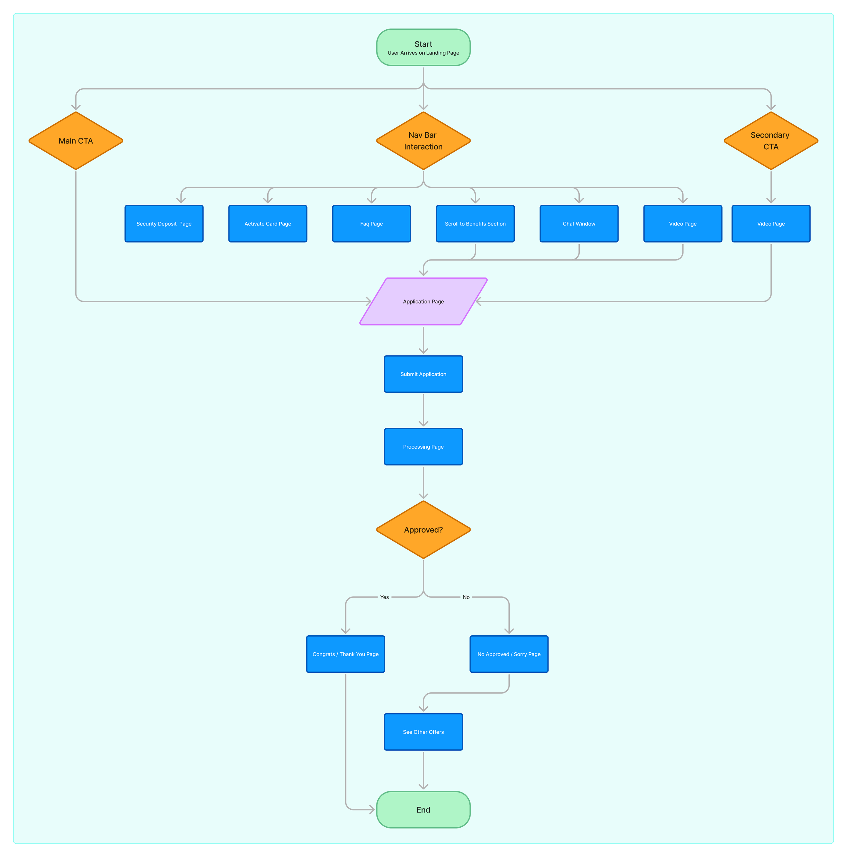
And there had to be a steps section, like a roadmap to salvation, guiding them through the application process. Easy to follow, clear as day. I wanted them to see that applying wasn’t a labyrinth of despair but a simple journey back to financial stability.
3. Building Trust with Testimonials: Trust? It’s a fragile thing, especially for those who’ve been burned. I knew I needed testimonials—real stories from people who had clawed their way back to the surface. These voices had to ring true, echoing the hopes and fears of those standing at the precipice, ready to leap. “If they can do it, so can I,” I wanted them to think.
4. Visual Design: I went with a palette of shades of orange and blue. Orange for the fire in their belly, the warmth of new beginnings, and blue for the calm, steady reassurance that they were safe here. I wanted the design to feel like a breath of fresh air, like stepping outside after being stuck in a smoky bar all night.
03The Process
1. Wireframing and Prototyping I sketched out the wireframes, thinking about how to get these weary souls from despair to hope. The layout had to be simple, like a quiet conversation over coffee. The headline leading into the benefits, followed by that steps section—each element a gentle nudge toward action.
2. User Testing: I showed it to a few brave souls, the ones willing to give feedback. Their reactions were raw and honest. The headline? Strong. The testimonials? Real. The steps? Simple enough for anyone to follow. I listened to their voices, made tweaks, honed the message until it felt right, until it resonated like a well-played chord.
3. A/B Testing: We ran A/B tests like a boxer taking jabs at the competition. Different headlines, different layouts. But in the end, it was the combination of that bold headline, the clear benefits, and the honest testimonials that knocked it out of the park.
04Final Outcome
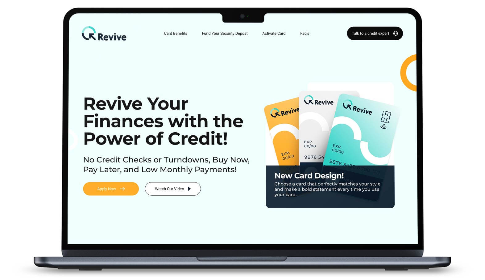
Empowering Headline: “Revive Your Finances with the Power of Credit” set the tone, motivating users to take control of their financial future.
Clear Benefits: The benefits—No Credit Checks or Turndowns, Low Monthly Payments, and Buy Now, Pay Later—were positioned directly beneath the headline to emphasize the advantages of the card.
Step-by-Step Process: The steps section clearly defined how simple and fast the application process was, breaking it down into a few easy-to-follow steps that users could quickly understand and act upon.
Trust-Building Testimonials: Real testimonials were featured throughout the page to offer social proof and build confidence in the card’s ability to help users rebuild their credit.
Strong CTA: Strategically placed call-to-action buttons encouraged users to apply after engaging with the content.
Color Palette: The shades of orange and blue reflected a balance of warmth and reliability, creating a welcoming space.
Responsive Design: The page was fully optimized for both mobile and desktop devices, ensuring a seamless user experience across all platforms.
When the dust settled, the numbers were staggering. A 25% increase in applications within the first month. People felt empowered, motivated, and ready to reclaim their financial futures. The combination of that headline, clear benefits, and heartfelt testimonials spoke to them, igniting a spark that encouraged action.
This project wasn’t just about design; it was about connection. By weaving together the narrative of hope with the stark reality of financial recovery, we created a landing page that resonated deeply with those who needed it most. It reminded me that design can be more than aesthetics; it can be a lifeline, a chance to help people stand up and fight for their future. In the end, we didn’t just build a page—we crafted a story, a pathway for those ready to say, “I can do this.”

Full Page View

