Objective
Make the Fortiva Mastercard page easier to understand and easier to act on, especially for people who were rebuilding credit and comparing their options quickly.
The redesign transformed the Fortiva landing page from a visually simple experience into a more conversion-focused funnel with clearer messaging, stronger visual hierarchy, and a more confident application flow.
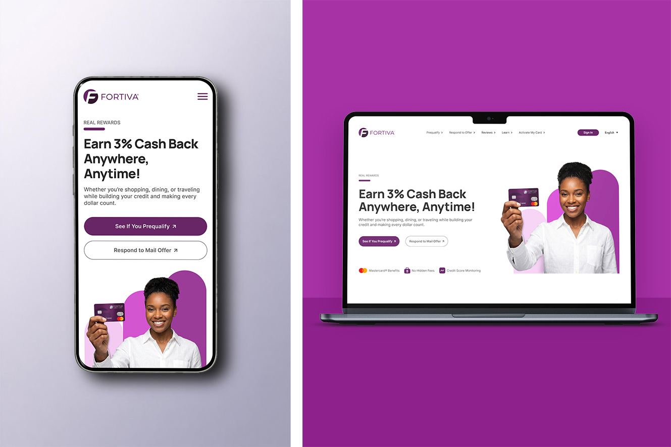
Fortiva Mastercard is for people rebuilding credit. That audience needs the page to be clear right away. They want to know what the card offers, whether it feels trustworthy, and what they should do next. The original page looked polished, but it asked users to do too much work. The main message was not clear enough, the calls to action competed with each other, and the page did not guide people through the decision. I redesigned it to make the offer easier to understand from the first screen and to keep the path to apply clear on both desktop and mobile.
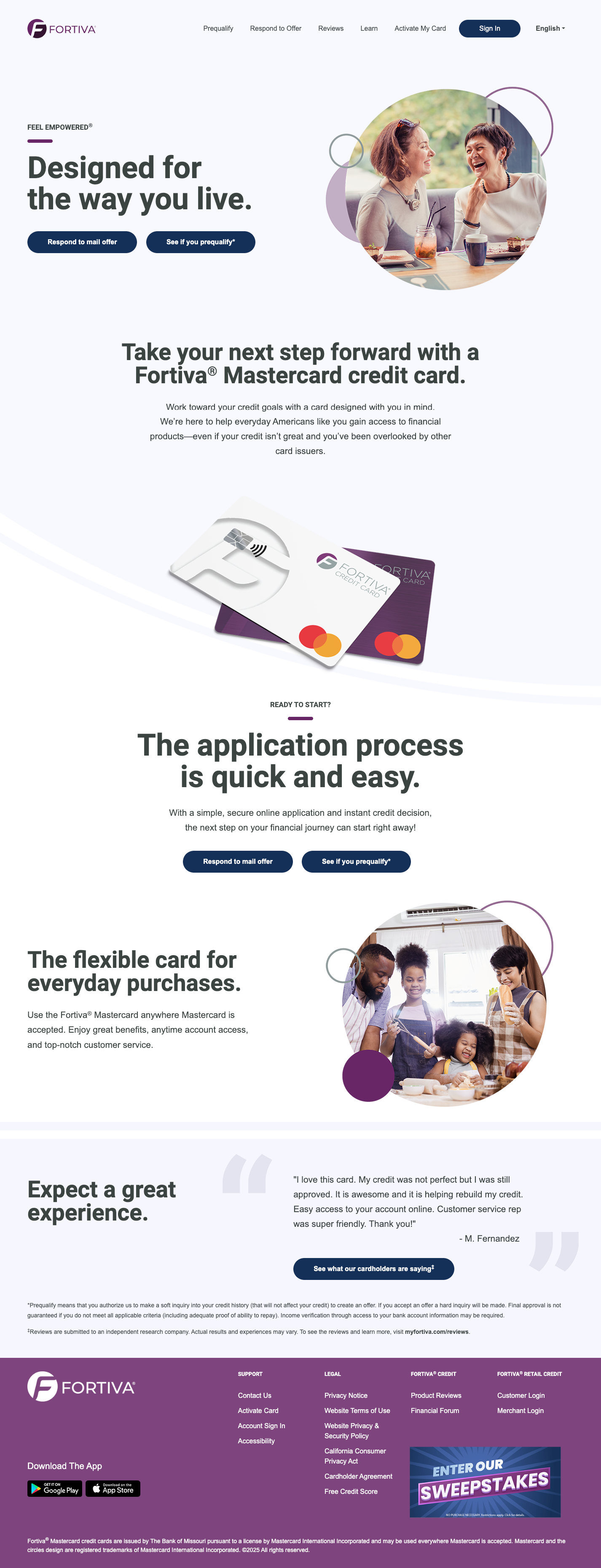
The old page did not give users a strong reason to keep going. The headline was broad, the value proposition was weak, and the page did not make prequalification feel like the clear next step. For someone rebuilding credit, the experience needed to explain the benefit faster and build trust earlier.
The headline was too broad and did not quickly explain why the card was relevant. Users had to work too hard to understand the core value before deciding whether to keep reading.
Multiple buttons carried similar visual weight, so the primary next step was not clear. Instead of guiding users toward prequalification, the page created hesitation around what action mattered most.
The hero image felt generic and did not help explain the product, offer, or next step. On mobile, it also showed up before the strongest value message, weakening early engagement.
Trust cues were pushed too far down the page, even though this audience needed reassurance early. Users had to scroll before seeing signals that could build confidence in the offer.
The page felt like a series of separate content blocks instead of one guided path. Users were not clearly moved from understanding the offer to feeling confident enough to apply.
The benefits were present, but they were not organized for fast scanning. Users had to slow down to understand the offer, which weakened clarity and made the value harder to compare at a glance.
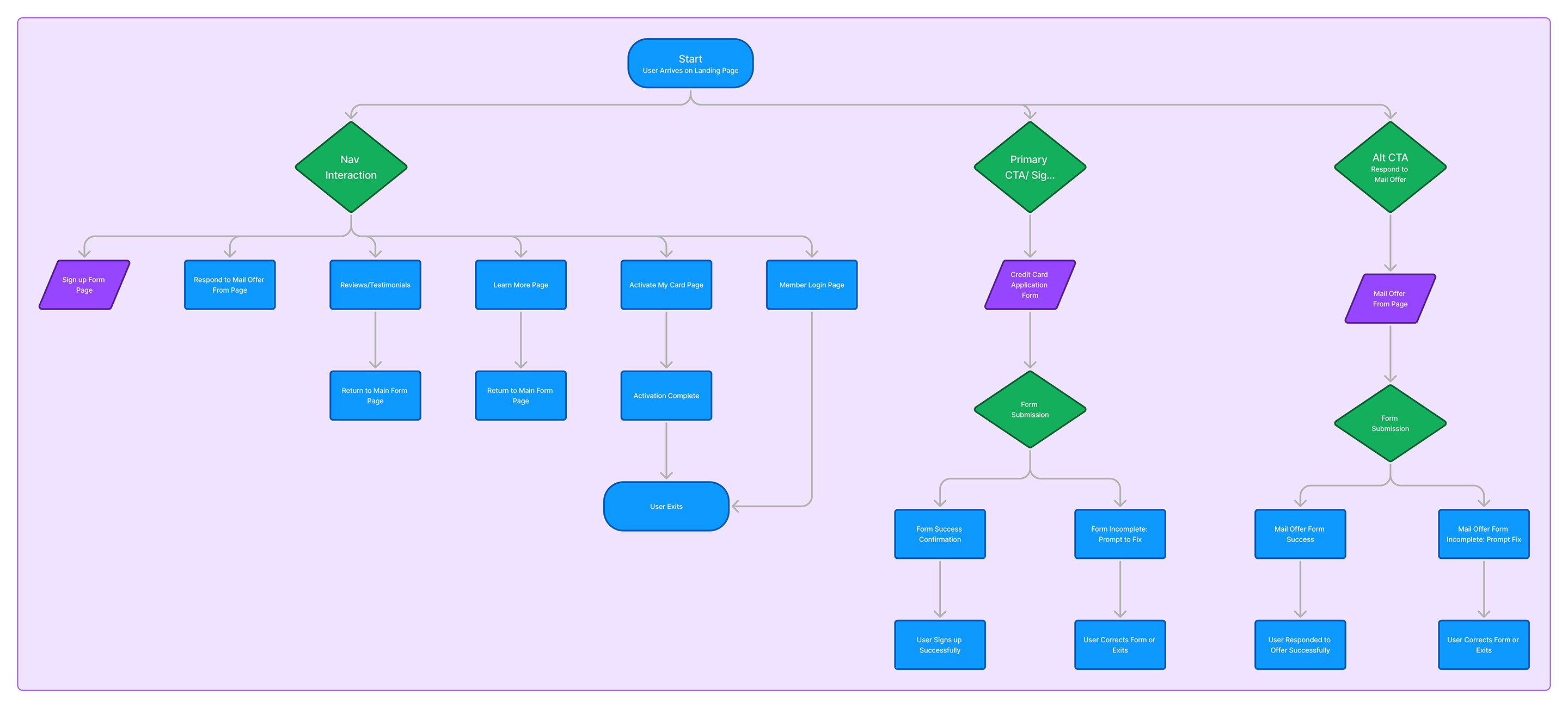
After reviewing the old page, I mapped the path from first impression to application. I wanted to see whether the page was answering the right questions in the right order: what is the offer, why should I trust it, and what should I do next?
The flow made the priorities clearer. The hero needed to explain the value faster, trust needed to show up earlier, and the main action needed to be easier to find throughout the page.
I treated the redesign less like a visual refresh and more like a cleanup of the decision path. The page needed to answer the user's questions in a better order.
The headline was rewritten to explain the offer faster and make the core benefit easier to understand. Users no longer had to search for the reason to keep reading.
The primary action was given stronger visual priority so the next step felt obvious. The page now guides users more directly toward prequalification instead of splitting attention across competing buttons.
The card was brought directly into the hero so users saw the product immediately. Supporting artwork was arranged to guide attention back toward the card and primary action area.
Trust cues were moved higher in the experience so users saw them earlier. This reduced the distance between the value message and the confidence-building signals needed to continue.
Benefits were reorganized into a cleaner pattern so the offer could be understood more quickly. The updated layout made the information easier to scan without slowing users down.
The middle of the page was broken into clearer content sections to improve rhythm and readability. Users could compare information more easily without feeling like the page was one continuous block.
The main apply action was repeated in key places where users were likely ready to move forward. This reduced the need to search and kept the conversion path visible throughout the page.
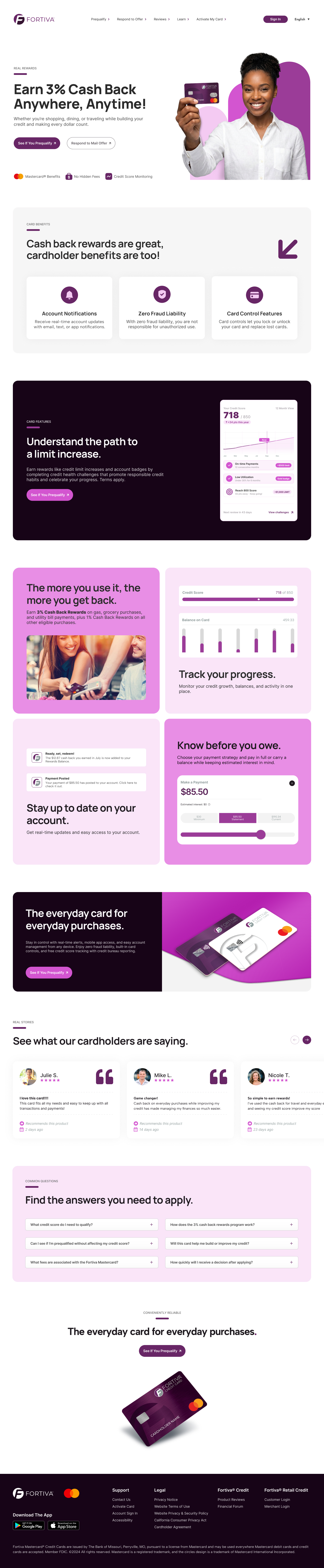
Use the toggle switch below to compare the original and redesigned experience. Scroll inside the image area to explore the full page and see how the layout, hierarchy, and enrollment flow evolved throughout the redesign.
This walkthrough highlights how the experience was adapted for mobile, with a stronger content hierarchy, clearer calls to action, and a layout designed for fast scrolling and easy decision-making.



The redesign changed the order of the story. Instead of leading with a broad brand message, the page now starts by answering what the card is, why it may be useful, and how to apply. By simplifying the CTA system, bringing the card into the hero, and moving trust cues higher on the page, the page performed better across the actions that mattered most: users stayed longer, clicked through more often, and moved toward prequalification with less hesitation.
This project reinforced how important clarity and trust are when designing for users rebuilding credit, especially a younger audience expecting faster, more intuitive digital experiences. The original page buried key value propositions, created friction between actions, and lacked a clear visual path through the experience.
The redesign focused on improving hierarchy, simplifying decision-making, surfacing trust signals earlier, and creating a more intentional flow between the messaging, card visuals, and CTAs. The biggest improvements came from making the experience easier to scan, easier to understand, and more confident in guiding users toward a single primary action.