Objective
Translate a feature-rich rewards program into a simple, compelling story while making enrollment the clearest next action.
I designed a conversion-focused landing page experience that simplified Dell Rewards messaging, improved scanability, and guided users toward enrollment through stronger hierarchy and structure.
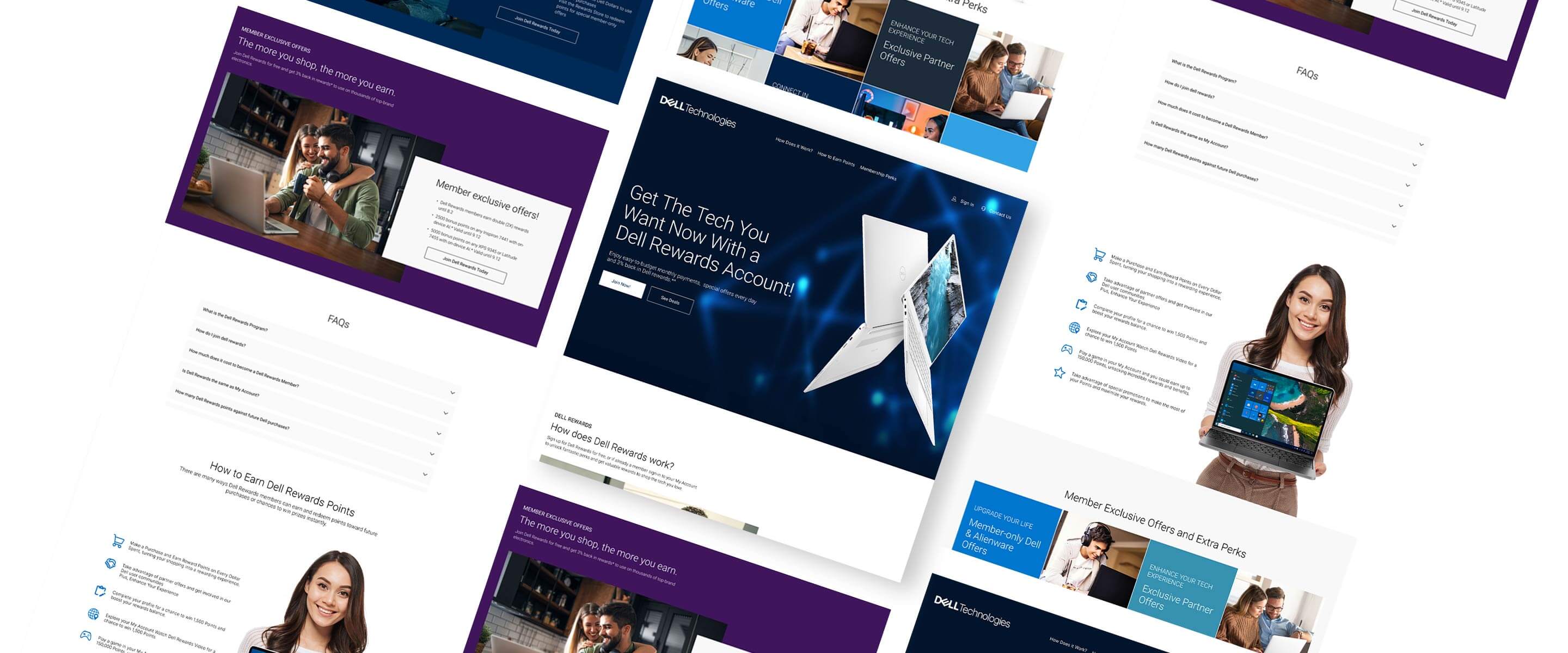
Dell Rewards included multiple promotional offers, financing details, and membership benefits, creating the challenge of presenting a large amount of information without overwhelming users. The experience needed to communicate value quickly while guiding users through a clear and structured enrollment journey across desktop and mobile.
The challenge was simplifying a feature-heavy rewards experience into a clearer, more focused enrollment journey.
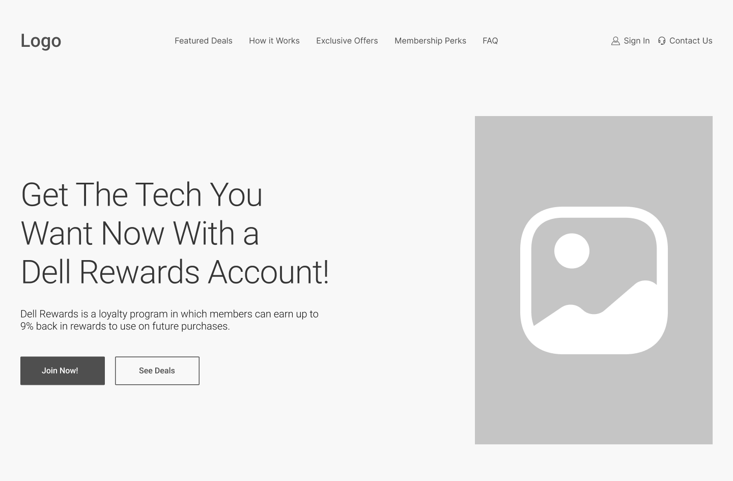
The project started with low-fidelity wireframes to establish layout structure, content hierarchy, section pacing, and the enrollment path before moving into high-fidelity design. The goal was to organize rewards information in a way that felt easier to scan while maintaining consistency with Dell’s brand system and product imagery.
Each section focuses on a specific part of the enrollment journey, comparing the early wireframe structure with the final high-fidelity design.
The hero section was structured to communicate Dell Rewards value immediately while keeping the enrollment path clear and visually dominant.
This section was designed to surface promotional offers quickly while preserving a clean scan pattern.
The points module was structured to explain how earning works in simple steps with clear sequencing and pacing.
The benefits area used a modular grid to make features easier to scan and compare at a glance.
This section framed long-term member value with balanced visual weight and clear transitions from promo content.
The FAQ block was placed to resolve enrollment hesitation with concise objection handling before final CTA actions.
The experience was intentionally structured to guide users from understanding the rewards program to enrollment without overwhelming them with information too early. Each section was designed to answer a specific user question in sequence: what the program offers, how rewards work, why membership is valuable, and how to enroll.

The final Dell Rewards experience combined structured hierarchy, modular content, and product-focused visuals to create a cleaner enrollment journey across the full landing page. Use the toggle to compare the final experience with the original wireframe structure.

The mobile flow focused on simplifying navigation, improving readability, and keeping key actions consistently within reach.



After launch, the Dell Rewards landing page showed strong engagement across key acquisition metrics. The page structure helped users understand the rewards value quickly, stay engaged through the content, and move toward enrollment through consistent CTA placement across desktop and mobile.
This project reinforced how important hierarchy and pacing are when designing acquisition-focused landing pages with large amounts of promotional and rewards content. The challenge was not adding more information, but organizing the experience in a way that helped users understand the value quickly without feeling overwhelmed.
It also reinforced the importance of designing modular systems that maintain clarity across desktop and mobile experiences. Many of the strongest decisions came from simplifying layout structure, creating more intentional section flow, and guiding attention toward a single clear enrollment path.